Sunday, December 10, 2023

Sneaky Clues Too - Postal History Sunday

Welcome to Postal History Sunday!  If you've been here before, you know what to do.  If you haven't - we're glad you decided to visit. 

Grab a favorite beverage, making sure to keep it away from the keyboard or the paper objects I will be sharing today.  Settle into a comfy chair and kick off the tight shoes and put on the fuzzy slippers.  If your brain is occupied by things that are less than positive, put them aside for a time while I share something I enjoy.  

And maybe...just maybe.  We'll all learn something new!

Clues to get from here to there

One of the skills a postal historian develops over time is the ability to "read" each cover.  The process of reading a cover allows a person to discover details about where an item was mailed, where it was destined to go, and where it went on the way there.  Reading a cover also helps us to determine what the required postage was and how much of that postage was actually paid.

Sometimes, there are sneaky clues that can either help us read a cover or confirm for us that our reading is correct.  I thought I'd start today with a heavier letter sent from France to Belgium in 1861.

40 centimes per 10 grams : April 1, 1858 to December 31, 1865

The French and the Belgians came to an agreement that the simple rate between their two countries would be 40 centimes for each 10 grams in weight.  This rate was put into effect in 1858 and continued until the end of 1865.  So, this would be the postal rate that would apply to this particular letter.

This letter entered the French mail system at St Etienne, France on April 27, 1861 and was destined for Roulers, Belgium.  The route this particular letter is not a big secret, because there are numerous transit marks on the back of the folded letter.  The letter boarded a train at Lyon that was bound for Paris on the same day it was mailed, but it didn't leave on the train out of Paris until the next morning.  

It took the train bound for Calais but, instead of going all the way to Calais, it was moved the Belgian mail system.  This is confirmed by two strikes of the marking that reads "France par Mouscron."  It finally arrived at Roulers on the 28th on the train arriving between 2 and 3 in the afternoon.


I suspect most people could figure out that markings dated on the 27th would have been placed on the envelope before those dated April 28.  But, you might be wondering how I deciphered the ordering of these markings with such certainty. And, you might also be justified in asking how I could make a claim that the letter arrived between 2 and 3 in the afternoon.

Roulers, 28 Avr. 2-3S, 1861

The sneaky clue that provided the answer for that last part was located in the receiving mark for Roulers (Rouselare).  Belgian rail markings often included a time stamp which allowed them to track the train that carried the letter.  The letter "m" would stand for "matin" (morning) and "s" indicated "soir" (evening).  Or, if it makes the US readers feel better, AM and PM.  

We can actually see a better (and clearer) example of the time marking here:

France par Mouscron, 28 Avr. 12-1S, 61

This is the Belgian exchange marking that was applied on the Belgian mail car that ran from Lille, France to Mouscron, Belgium.  It was there between noon and 1PM according to the 12-1S portion of the transit marking.

The actual border crossing was at Tourcoing (France).  For those who like a little bit of trivia, the rail line from Tourcoing to Mouscron was the first to cross a European border (1842).  Mouscron was a key junction for the Belgian railroads at the time.  So, while Roulers was not terribly far away (just northwest of Courtrai), it is likely that there was a transfer or either mailbags or mailcars at that location.

From a collection of images at this site (viewed 12/9/23)

The other, not so sneaky, clue to determine the order these markings were applied has to do with geographical knowledge - or access to maps.  If you know St Etienne is closer to Lyon, that will help get you started.

The other puzzle with this cover is determining how much postage was paid (and why that much postage was paid).  The three postage stamps each represent 40 centimes in postage paid.  The "P.D." marking tells us it was considered paid in full.  But, once again the postage rate was 40 centimes per 10 grams.  So, this must be a triple weight letter.  

  • A simple letter would weigh no more than 10 grams (40 centimes)
  • A double weight letter would weigh more than 10 grams and no more than 20 grams (80 centimes)
  • A triple weight letter would weigh more than 20 grams and no more than 30 grams (120 centimes)

But, I can tell you that this letter weighed 25 grams - because of this sneaky clue.

Clues to figure out what the postage paid for

I thought I would stick with some Belgian postal history and show a folded letter from Mettet, Belgium, that was mailed in December of 1854 to Charleroy, also in Belgium.  So, this is an internal letter, rather than a letter exchanged between nations. 

40 centimes for a local letter (under 30 km) weighing 20-60 gms (Jul 1, 1849 - Oct 31, 1868)

This is a domestic letter with two 20 centime stamps to pay the postage (a total of 40 centimes).  The question is - why was 40 centimes needed to mail this letter?

Belgium's internal rate structure from July 1, 1849 to October 31, 1868 was fairly complex.  It maintained both a distance component and a weight component to determine the cost of postage for any given item.  Any letter that had to travel 30 km or more would have to follow one rate table and local letters (less than 30km distance) would follow another.

The weight component was not a linear progression either.  The base rate was for mail weighing no more than 10 grams.  That would cover the majority of letter mail.  The next rate level was for mail that weighed over 10 grams and no more than 20 grams.  The third rate level was for mail that weighed more than 20 grams and no more than 60 grams.

So, what are the clues that we can use to figure out the rate for the folded letter shown above?

Clue #1: 40 centimes in postage paid appears to have covered the cost

The stamps have their cancellation markings and there are no markings on the cover that tell us more money is owed by the recipient.  That means the postage rate was 40 centimes OR less.  After all, a postal service only cares if you don't pay enough.  If you want to pay too much, that's your business.

Clue #2:  How far apart are Mettet and Charleroy?

It turns out that they are roughly 24 km distant from each other.  This tells us that this was probably a "local" letter.  I say "probably" because the distances we see in today's maps are not necessarily representative of how the Belgian postal services in 1854 classified it.  Instead of having exact mileage, most distance rates were calculated by seeing where each possible destination settlement landed in a table predetermined by the post office.  Still, given the modern measurement, odds are very good that this was a local letter (under 30km). 

So, if we know that a local letter required 40 centimes for an item weighing more than 20 grams and no more than 60 grams, we have (mostly) solved the problem!  We cannot eliminate the possibility that this was an overpayment for either the first or second rate levels.  But, the simplest solution is to say that the postage paid the third rate level for a local letter.

Clue #3 A weight is referenced in a docket:

Located at the top center of this piece of mail is a scrawl that actually reads "25 Gms."  It is likely a weight written by the postal clerk.  And, as it turns out, 25 grams is between 20 and 60 grams.  So, this letter was mailed at the third rate level for a local letter, which required 40 centimes in postage.

I could have come to the likely correct conclusion with either the distance or the weight docket, but there are times when one clue is not enough.  And, even if one IS enough, it can be helpful to have corroboration between clues.  If they contradict each other, we would have a bit more of a puzzle on our hands - and it could be one that is not solvable.

40 centimes per 15 grams: Oct 1, 1857 - Jul 31, 1865

Here is another piece of Belgian letter mail from 1858.  This cover originated in Bruges, Belgium and was sent to Dublin, Ireland.   The two postage stamps total 80 centimes in postage paid to mail this letter.

The postage rate between these two locations was simple: 40 centimes per 15 grams (effective Oct 1, 1857 - July 31, 1865).  So, the easiest (and correct) conclusion is that this paid the postage for a double weight letter (something over 15 grams and up to 30 grams).


Well, we can tell you that this letter and its contents weighed 16 grams according to the docket find just above and to the left of the Bruges postmark.  

Unlike the second example, this one is much easier to read and identify.  In fact, it was this cover that taught me to look just in case this clue is a part of a postal history item.  Most mail does not bear a docket or marking that indicates the weight of the letter.  But, when it does, it provide s valuable information.

Eights are wild

I thought this folded lettersheet mailed in 1853 from Switzerland (Chaux-de-fonds) to Paris (France) would be a logical next step.  See if you can figure this one out without me giving you the answer.

This was an unpaid letter (no postage stamps), so the recipient would be expected to pay that postage in order to receive the letter.  And the rate was 40 centimes per 7.5 grams in weight.


There are actually three numerical markings on this particular item.  You probably recognize the two "8's" - but the squiggle at the lower right (looks like a lower case "n") is actually a "4."

The "4" has been crossed off (notice the two lines going through it) because the receiving postmaster must have determined that the letter weighed too much.  They put the larger "8" in the middle indicating that the recipient must pay 8 decimes (80 centimes) to receive the letter.  In case you didn't remember, the French preferred to do their accounting in decimes (1 decime = 10 centimes) and you can think of a decime as a dime, if that helps you.

Initially, I did not understand the purpose of the 2nd "8" at the top left.  Maybe the postmaster just wanted everyone to understand "Hey!  I really meant 8 decimes, not 4 decimes.  See!  I put it here twice!"  But, even more likely is that the smaller "8" is the weight of the letter - 8 grams.  They just did not bother putting the weight unit with it this time.

By putting the weight on the letter, I suspect they felt it would serve as an explanation as to why they rejected the first 4 decimes rating.  The recipient, on the other hand, probably did not need or want to know that the weight was over by just a half gram.  If anything, they were probably just annoyed that they had to pay twice as much for this particular letter. 

Not just an 1850s thing

Below is a letter mailed from the Netherlands to England in 1914.  World War I was actively engaged at the time, so most mail between nations had to go through a censorship process.  After the censor read the letter and removed any information they didn't feel should be included, they would reseal the letter with some sort of seal or tape (like the pink you see in the cover below).

This letter carries 37 1/2 Dutch cents in postage.  At the top left, you can see the weight "44 grams" written in pencil.  I wonder why that is there?

Well, I'm going to work backwards first.  The fee to send registered mail from Holland to England was 10 cents (Jan 1881 - Mar 31, 1921).  That leaves us with 27 1/2 cents in postage paid by the blue stamp at lower left.

The letter rate for mail from the Netherlands to England was as follows:
    1st 20 grams: 12 ½ cents
    each additional 20 grams: 7 ½ cts 

If the letter weighed 44 grams, we would be in the third weight level, then the postage rate should have been 27 1/2 cents.  

As a side note, take a look at the address panel on this envelope - "To W.T. Wilson Stamp Dealer"

Yes, this was a piece of mail to an individual who sold postage stamps to philatelists (people who collect and study postage stamps).  That, by itself, could explain a few things.

Giving credit where it's due

This time, we're going to start with a letter that was sent from Newport, Rhode Island to Paris, France in 1866.  Can you guess what "sneaky clue" I am going to focus on?

Actually, this time around, I wanted to show how well ALL of the pieces of the story being told by this envelope work together. 

The red "45" at the bottom left is equivalent to the amount of postage found on this envelope: one 24-cent stamp, two 10-cent stamps and one 1-cent stamp = 45 cents total.

The postage rate for letter mail from the United States to France at the time was 15 cents per 1/4 ounce of weight (effective April 1857-Dec 1869).  Forty-five is a multiple of fifteen, so that's a good sign.

The numbers in red pencil read "36 / 3" - which is exactly what they should be.  But why?

I took a moment to enhance the red pencil mark and remove some of the distracting marks from the address panel so you can better see what it is that I am referring to.  

The "3" is in reference to the fact that this letter must have weighed more than 1/2 ounce and no more than 3/4 ounce.  In other words, postage needed to be three times the simple letter rate (15 cents).  So, this number confirms the amount of postage AND the "45" marking at the lower left.  So far so good.

But, what is it with the "36"? 


This is where the docket AND the round, red Boston marking come in.  The docket reads "per Cunard Steamer of Wed Dec 5th from Boston."   The red Boston marking is dated December 5 and states that the postage is paid.  It certainly is nice that both of these things agree about when this letter was put on a steamship (the Cunard Line's Africa) - but this is ALSO where the "36" ties in to the whole story.

Of the 45 cents collected in postage by the United States, thirty-six cents were to be passed on to France so they could pay for their expenses AND so they could pass money to the British.  After all, the Cunard Line was under contract with the British Postal Service to carry the mail across the Atlantic.  

In the end, the postage was broken down as follows:

  • 9 cents for the United States
  • 36 cents went to the French who used it to pay for
    • 18 cents to the British for the trip across the Atlantic
    • 6 cents to cover the British surface mail and transit across the English Channel
    • 12 cents kept by the French to pay for their own postal expenses.

Now, these amounts are rough approximations, because the British wanted their shillings and pence and the French their centimes and decimes.  So, of course, the French would take their equivalent from the US 36 cents and then pass amounts in their own currency on. 

In any event, the 36/3 marking is correct because the ship that carried the letter across the Atlantic had a contract with the British.  If that ship had been contracted with the United States or France, the first number would have been different - and so would the red pencil markings.

And that's how it all ties together.  Why is this interesting or important to a postal historian?

What would happen if we had a letter that did not have a docket, did not have the red "45" and the red Boston marking was smeared?  If there was only a "36/3" clearly written in pencil and 45 cents in postage on the envelope, we could still be able to piece most of the story together because we've seen items (like this one) where all of the pieces are completely and clearly spelled out.  That's part of the reason why I have worked to become more conversant in "sneaky clues."  Sometimes, not everything will be as easily read as they are on our first example.

And sometimes it just wasn't enough

Here is an 1856 folded letter that was sent from Nancy, Franc to Paris.  There is a 20 centime stamp at the top right and the red box at the top left reads "affranchissement insuffisant" (insufficient postage).

As a public service, I now give you a table that shows the internal letter rates for France during the second half of the 1800s.  I highlighted the text of the row that applies to this letter.

Prepaid Internal Letter Rates for France

Date 1st Rate up to 2nd Rate up to 3rd Rate up to Additional Per
Jan 1, 1849 0,20 7.5g 0,40 15g 1,00 100g 1,00 100g
Jul 1, 1850 0,25 7.5g 0,50 15g 1,00 100g 1,00 100g
Jul 1, 1854 0,20 7.5g 0,40 15g 0,80 100g 0,80 100g
Jan 1, 1862 0,20 10g 0,40 20g 0,80 100g 0,80 100g
Sep 1, 1871 0,25 10g 0,40 20g 0,70 50g 0,50 50g
Jan 1, 18760,25 15g 0,50 30g 0,75 50g 0,50 50g
May 1, 18780,1515g----0,1515g

A simple letter would weigh no more than 7.5 grams and would cost 20 centimes.  Apparently, the person who mailed this felt the letter was not too heavy and paid the cost for a simple letter.  The French postal clerk, on the other hand, did not agree - and they gave us evidence of that fact.

Well, well.  It looks the writer exceeded the weight limit by one-half gram (the marking above reads "8 g" or 8 grams).

For reference, 1/2 gram is the weight of half of a typical business card or half of a raisin.  It's not much.  But, rules IS rules - and this letter simply weighed too much.  Which means the amount of postage paid should have been 40 centimes.

At that time, the regulations for short paid mail in France required the recipient to pay the full amount of postage AS IF nothing had been paid at all.  In other words, the postage stamp paid for none of the postage required to send this item.  Think of it as a donation to the French Post Office if that helps your understanding.  

It may not seem fair that no credit was given for the postage provided - but at the time post offices around the world were trying to enforce pre-payment of letters.  Maybe a few harsh economic lessons would be enough to get the point across?

So, the amount due to the recipient was 40 centimes, which is represented by the big squiggle shown in the image at the left.  Yes, that is a "4," which stands for 4 decimes (equal to 40 centimes).  Remember, the French often used decimes for postal accounting, which is the equivalent to Americans referring to 4 dimes instead of 40 cents.

Now, if you are still staring at the squiggle and STILL don't see a "4," I understand.  This just might be one of those times you're just going to have to trust me.

Let's get a bit more complicated!

Uh oh!  Here's that Thurn and Taxis post again!  Take a look at this 1865 folded lettersheet mailed from Sonneberg (Thuringia) to Leipzig (in Saxony).  Thuringia was another area, like the Hessian States, that used the house of Thurn and Taxis for their mail.

The target-like cancellations on the stamps have the number "265" in the center, which was the number assigned to the Sonneberg post office.  The pencil number "265" with an arrow pointing to the purplish marking was put on the cover by a previous collector.  The intent is probably to indicate that they determined that the purple marking was also applied in Sonneberg.

This marking indicates that the letter was sent as a "registered" letter (Recommandirt).  In order to register a letter, an additional 6 kreuzer in postage was required.  And, some of the numbers found on this cover - those at the top right - are numbers used to track the progress of this letter as it traveled to its destination.  The "293" was likely the number in the Sonneberg ledgers that tracked this letter's departure and "205" may well have been Leipzig's ledger number to record the reception of the letter at their office.

So - we have 6 kreuzer spoken for - that leaves us with 12 kreuzer in postage paid.

The rate between Sonneberg and Leipzig was 6 kreuzer per loth.  At the time, mail in the German States included both a distance and a weight variable to determine the postage required.  The distance between the two cities was between 10 and 20 meilen (German miles) - if they had been closer it would only cost 3 kreuzer per loth.
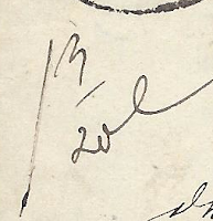

And, there it is!  Our sneaky clue resided at the left, just under the postage stamps.  This scrawl in black pen reads "1 3/20 L," with the "L" standing for loth, the weight unit in use by German postal services at the time.  One loth is roughly equivalent to a half ounce.

So, this letter weighed over one loth and no more than 2 loth, which made it a double weight letter and the total postage needed can be calculated in this fashion:

  • Registration Fee 6 kreuzer
  • Rate per loth for distance between 10 & 20 meilen - 6 kreuzer x 2 = 12 kreuzer
  • Total = 18 kreuzer

Look on the other side


Here is another piece of French postal history to consider from 1864.  This item was also sent as a "registered" item (ChargĂ©).  But, that's not what I want to focus on this time around.  

This item was returned to the sender, which would have been the Tribunal Court in Chambery.  The contents are a court summons that apparently did not find the person they were "summoning!"

But, how did I know this was returned to the sender?

The sneaky clue is at the bottom right, just under the Chambery postmark.  The words "au dos," when placed on a piece of letter mail explains that the carrier or clerk should "look on the back" for more explanation.  So, I looked on the back - and this is what I found:

The word "Inconnu," which would translate to "unknown."  The post office in Chambery was unable to locate the recipient of this court summons and they simply returned it to the Tribunal.  

Well, if the postal service can't find you, I guess you don't need to go to court.

And sometimes, there is no postal significance

Let's close with this 1867 envelope that was sent from New Orleans, Louisiana to Kurnik, Prussia (now in Poland).  The postage applied is 28 cents, which is the correct postage for a simple letter sent to Prussia (not weighing more than 1/2 ounce).  The New Orleans, New York and Aachen markings clearly show the travels this letter took and the dates it visited each location.  A single marking on the back tells us it arrived at the destination post office on April 15.

But, what is all of this?  The use of blue and red pencil might be an indication that there might be some postal significance - but what?

I have to admit that I was puzzled by these markings for some time.  The numbers "15" and "4" really don't connect to any postal rate calculations that I could determine.  And, there was no reason (and no way) for this item to have traveled through Orleans, France.... unless that is not the word "Orleans" written in blue.

So, this particular set of markings sat in my "to be solved" list for a long time.  Until, one day, I asked the right people and got an answer that makes perfect sense.

This is a docket written by the recipient, simply recording that the letter was received on the 15th of April (4th month) from Orleans (New Orleans).  The little red squiggle before the numbers was simply an abbreviation to indicate a received date, which matches the date of the postal arrival date on the back.  They must have changed from a red to a blue pencil because the former was dull and they just wanted to finish the job without pausing to sharpen it.

Sometimes the answer is so simple that it is almost embarrassing to admit it to others.  In this case, I think I can hide behind the fact that most Americans list dates in month/day order rather than day/month order.  That's about the only defense I have right now - but I do feel much better now that the mystery is not so much of a mystery any more. 

Thank you for joining me for a longer Postal History Sunday this week.  I hope you were at least slightly entertained and maybe you learned a new thing or two.  Have a good remainder of your day and a fine week to come!

-------------------------------------

Postal History Sunday is published each week at both the Genuine Faux Farm blog and the GFF Postal History blog.  If you are interested in prior entries, you can view them, starting with the most recent, at this location.

Saturday, December 9, 2023

December Playlist


 It's time for a new music playlist.  I'm not feeling like putting in many words.  So, if you find something you like here, good!  If not, feel free to locate something to listen to that makes you happy - everyone wins!

Thinkin' Till the Crack of Dawn - Charlie Peacock

Twenty Four - Switchfoot

 Fairpoint Diary - Over the Rhine

 Seemann - Apocalyptica featuring Nina Hagen


 Gorgeous - Violet Burning

 Just Who - The Choir

 Homeboys - Adam Again

Armageddon - Anberlin


 Rocketship Jesus - the Ascendants

It Doesn't Feel Like Christmas - Sam Phillips

 Christmas Upon Winter Hill - All Hail the Silence

This list - per the norm - goes to eleven.  Have a fine weekend everyone!

Wednesday, December 6, 2023

Experiments That Worked - Sort of

One of the things about small-scale, diversified farming is that you are always in the middle of change.  There are always new things and there are always experiments.  And many of those things are adjustments to what has gone before because the old methods are no longer sufficient for how things work at the farm at the present moment.

A perpetual project over the years at the Genuine Faux Farm has been poultry housing with safe access to quality pasture.  There were numerous projects where we, often along with other workers or volunteers, built a new shelter solution for the hens, or turkeys, or broiler chickens, or ducks.  

Often, these projects relied on repurposing raw materials already on the farm.  For example, the "portable" broiler shelter shown above was made of cattle panels that came with the farm when we bought it and lumber from a building that had come down.


We attached some handles on the base to lift and move these buildings, but opted to not put wheels on them for a number of reasons.  The end walls were shorter cattle panels that were covered with either tarp or chicken wire to keep birds in at night and predators out if they managed to get past the electric netting that circled the pasture area.

The initial goal was to provide us with something that two people could move periodically so the poultry could have a fresh areas to bed down regularly.  And, it worked.  Sort of.

If the day we moved the building was nice, things worked out just fine.  If it was a day where we had a couple of workers on the farm, it was even better - because four people moved it much easier than two.  But, if it was windy or the ground was wet, things could get a bit sketchy.

The beginning of the end for these (we made two) shelters serving as "frequently mobile" came after one of us slipped in a wet field and fell under the building.  While we avoided any serious injury, it was obvious that changes had to happen.

The end result is that these shelters stayed in place longer, often with straw bedding, waiting for the good days with extra help to move them.  And, of course, when it came time to move to a different part of the farm, we could use a hayrack to take it most of the distance.

These shelters worked well enough for us for several years until, as happens with such things, the base rotted out and the cover broke down.  But, by then, these were relegated as either emergency shelters or as a shade area for poultry during the warmer months.  We moved on to new, portable buildings with skids that we could move with the tractor - and only one person was needed to move these building every other day.

And that's one of the key parts of farming.  Seeking solutions and then improving on those solutions as you learn more or conditions change.

Tuesday, December 5, 2023

Farming for More than Yield and Money

The following is a cross-post of material I wrote recently for Pesticide Action Network and their Ground Truth blog.  As I often do, I am re-posting in our farm blog in the week following its release on the PAN website.  Thank you for considering my thoughts and words.

---------------------------------

One of the stories that is frequently told to, and sometimes by, farmers is that growing food or crops is all about yield and the bottom line.  It doesn’t matter whether you are a grazier, a row crop farmer, an orchardist, or you work a small-scale, diversified farm; the temptation is to measure the success of your efforts based solely on these two measurements:

Did the farm produce as much as it could have?

Did the farm bring in as much income as it can?

Unfortunately, when a person views farming that way, they fail to consider so many other measurements of success that are just as important.  This limited set of measures also fail to recognize that there is a difference between “enough” and “as much as is possible.”

I like to broaden my farm’s balance sheet to include measurements that go beyond total yield and profit.  In my opinion, there is much more to being a successful farmer and land steward than money and yield.

Considering investment in natural assets

When a farmer considers only how much they can produce and to turn it into the most money they can get, they close their mind to investments that can bring stability to future production and success.  This short-term thinking makes it easy to pretend that pesticides, synthetic fertilizers, mono-cropping (one crop in a field) and tilling up every square inch of land are not only good ideas, but the best ideas. Suddenly, confining as many animals into a shelter as possible because there is a better return per square foot of space suddenly seems reasonable and even preferable.

Instead, land stewards recognize that the health of the soil we grow our crops in needs to be maintained with an eye towards future success, not just this year’s numbers.  A cover crop will represent an expense on the regular balance sheet, but it can be an asset for soil health.  A perennial crop in the rotation may represent a loss in potential income for a season or two, but it also provides value when we consider the health of the land being farmed.

Bumblebees in borage
 
On our farm, we have considered the health of our pollinators to be another line on our balance sheet that needs attention.  Many of our crops are pollinator-dependent.  If we want them to produce, we need these natural workers to be present.  So, we invest in them by intercropping plants that attract these organisms and we maintain wild spaces so they have a refuge and a home nearby from season to season, year to year.

Considering a broader farm balance sheet

We also find ourselves thinking about a balance sheet that goes beyond our farm.  Rather than focusing only on this season’s production and income, we consider how what we do impacts our neighbors, our communities, and our environment.

There are many farms, like ours, that produce a wide range of foods and strive to sell those foods locally or regionally.  It should not be a surprise that a direct relationship with the market encourages investment into the communities where that market resides.  Sometimes that investment comes in the form of money, such as when our farm buys feed from another local farm for our laying hens, or when we pay an accountant in town to help us with our taxes.  But, it is just as likely that growers, like ourselves, will be found at local events supporting schools or donating food to a community dinner.

It should be no surprise that the connection to the community lands on both sides of the balance sheet.  Certainly, there are some costs that come with running a local business of any sort.  But, they are outweighed when you consider the support the community can give the farm when things aren’t going well.  And when it comes to product pricing, a farmer has an opportunity to be a price-maker, covering their expenses, rather than a price-taker, being forced to accept a loss because a broader market forces it to happen.

Thinking beyond yield and money

We need to challenge ourselves to think even more broadly.  For example, many vegetable farms use plastic mulch to help control weeds in their crops.  We understand fully why this option is a popular choice.  The cost per foot is relatively low and weeds are often one of the toughest things to deal with in a growing system.

Unfortunately, plastic mulch can only be used once.  After that, it just becomes more single-use plastic in the landfill.  In this case, it is important to consider the larger balance sheet that includes a broader segment of society than the effect on our farm and its immediate surroundings.  After thinking hard about this, our farm moved to using mulches made from organic materials, such as paper, straw and grass.

Straw mulch in intercropped field

This decision was reached out of concern for (for lack of a better phrase) the greater good.  But, it turns out there were some very good reasons to do it for our farm’s good.  First, these natural products break down and produce organic matter for our soil, while still suppressing weeds effectively.  And, it turns out that the use of black plastic over a longer period of time actually can result in a build-up of plastic debris in the soil.  By avoiding their use altogether, we prevent this from becoming a future problem on this land we steward.

A broader focus leads to better farming

I fully recognize that all of this might sound idealistic and impractical.  But, I would like to suggest that our current focus on the two outcomes, yield and profit, are far less practical.  Each time we have challenged ourselves to think more broadly about how our farm performs we’ve been able to identify options that ended up providing more benefits to more people and the environment.  Often (but not always) these choices included better long-term yield or profitability for our farm along the way.

So, why don’t more farmers think this way?  The system we have in place for food and farming is a big part of the problem. It’s in the interest of chemical companies and Big-Ag to encourage a focus on profit, yield and short-term risk/gain, because it drives up their profit.  For example, crop insurance measures risk on the basis of a single season, so options that might be good for the medium or long term success of the farm aren’t encouraged.  In effect, farmers can find themselves feeling trapped with few alternatives to pesticides and large, industrial farms.

The good news is this: There are farms, like ours, that still manage to be successful when they look at a broad-view balance sheet, despite the systems that are in place.  Imagine what we could do if we changed our policies, stopped catering to industry, and supported successful farming beyond yield and profit.

Monday, December 4, 2023

Thirteen

It was thirteen years ago that we were pulling in our first harvests from Eden, our first high tunnel. A couple weeks ago, I wrote a blog remembering the construction of Eden at the Genuine Faux Farm and I've been reflecting on that as a major turning point for us and our farm.

I decided to pull out an image from November 20, 2010 that shows the inside of Eden on that date.  There was a whole host of green crops ready to harvest at that time.  We were well-positioned to sell fresh produce right up until Christmas that year - a year where we had come within a whisker of calling the Genuine Faux Farm a failed experiment.

This year is, of course, very different from 2010.  We opted not to plant a high tunnel full of greens for the cold season sales.  And, oddly enough, it wasn't so much because we didn't think we could grow them.  It was more the fact that we knew we would not have the time available to harvest, clean and find homes for it all.

Okay.  We probably didn't have the time to plant and care for them either.  Things have been that busy for the two of us in the off-farm professions.  Still, I find myself looking a bit wistfully at this image.


And speaking of wistful... if that even comes close to accurately describing the feeling.  There are a total of four digital images for my November 2010 folder.  Two show Eden in its full-glory of late Fall, early Winter crops.  The other two show something else that was new to us at the time.  Actually, there were two someone elses that were new to us, starting that October.

I have no idea how we got Bree and Hobnob to strike a similar pose on the same chair... at different moments, no less.  Hobnob never was one to pose for the camera.  Yet, there she is.   

As many who read the blog know, we lost the "Zoom Meeting Cat," Bree, this past year.  Hobnob preceded her sister a year before.  So, while 2010 was a year of big transitions at the Genuine Faux Farm, so too is 2023.  We both still find ourselves responding to dark piles of clothing on the bed because our brains initially supply us with the identifier "sleepy kitty" and it takes a moment to remind ourselves that their sleep is a bit deeper than a cat nap now.

A quick glance into the northwest pastures in September of 2010 shows us some turkeys.  They are kept in one section of the pasture by some fencing we would have to take down in 2012 after a spray plane applied pesticides in this area.

But, that's not quite what is getting my attention.  What's getting my attention is what's NOT in the picture.

The biggest missing item is... Crazy Maurice, the farm's Weeping Willow!  And, of course, there are other tree friends, like Blaze, the Maple and Loki, the Locust.  There's even a new permanent fence with gates and everything for the hen pasture.  

What would our 2010 selves say if they could transport into 2023 and see what things look like now?  Would they be pleased, shocked or dismayed?  Perhaps there would be parts of all three.  Of course, we'll never know for certain.  But it's interesting to even consider it.

I can say that we had some visions for this future.  That's why we have made some of the decisions and taken some of the actions that led us to this present reality.  But we can't honestly say that things turned out exactly as we expected.  After all, life is too complicated to be able to predict how thirteen years are going to treat you and the land you steward.

Sunday, December 3, 2023

A Little Help Goes a Long Way - Postal History Sunday

Welcome to this week's Postal History Sunday!  As we enter the final month of the year I am forced, once again, to reconcile myself to some of the realities of the academic year.  Those of you who have connections to schools, colleges or universities can probably relate to this.  While I am no longer directly involved, my lovely bride is.  As a result, I get to live the life of the school cycle vicariously!

To put it succinctly, December typically goes by in a blur.

And so, this week, I am going to focus on some of the aid I have received from many other people as I seek to learn more about postal history.  For those of you who do not do much with postal history, it might be interesting for you to learn that there is a community of people who enjoy this subject.  That community is often very willing to share information and knowledge.  And, if you are involved in postal history, you are already aware of that community, or if you aren't, I should encourage you to participate!

As I started to gather material for this article, I realized I was going to have more than I could reasonably manage to put into one blog.  So, I am going to focus on items where I received some help from the members of the Facebook Postal History - Covers and Stationery group, started in 2017 by Manny Brautigam and Mark Goodwin.  I suspect a future PHS or two will feature other forums.

Pretty Covers Deserve Good Descriptions


The folded letter sheet shown above was mailed in Hannover (Hanover) on Jun 27, 1854 and was destined for Leipzig, in Saxony. Hannover was the major city in the Kingdom of Hannover at the time.  This German State comprised most of northwest Germany, bordered by the Netherlands, the North Sea and the River Elbe.  The Kingdom of Saxony was located southeast of Hannover and travel through other German States was required to get the letter from one place to the other.
 
Hannover was a member of the German-Austrian Postal Union (GAPU), which had a collective postal agreement that set rates based on a combination of distance and weight.  This particular letter was a simple letter weighing no more than one Zollvereins-Loth (zolloth) which was equivalent to 16 2/3 grams. The cost was 3 silbergroschen for a distance over 20 meilen (3 silbergroschen was equal to 1/10 thaler in Hannover).

Isn't it fun when we use a whole bunch of monetary, weight and distance units that many of us are not immediately familiar with?!  No?  Ok.  Let's just say this simple letter was properly paid to get from Hannover to Leipzig and move on.
 
The letter is sent from one cousin in Hannover to the other in Leipzig, and this is where I got some interesting information from Ralf Reinhold.  He points out that the address includes this description «Piano-Forte Fabrik des Herrn Irmler in Leipzig».
 
1850 Ernst Irmler & Sons piano from Antique Piano Shop

Apparently, cousin Eisenbrandt worked for a well-known piano maker.  It appears that the Irmler piano business is still active, and Ernst Imler had a separate pianoforte business at the time.  He was a close relative of the Irmlers that founded the company that still operates today.  I am not sure if I can distinguish whether this individual worked for one Irmler or the other.

The name "pianoforte" is a combination of Italian for, essentially, "soft and loud."  Musicians among you will recognize the purpose of each, indicating the amount of volume you should achieve with your playing.  Also known as a fortepiano, these were invented around 1700 as an improvement over other keyed instruments (harpsichord) that had no volume control.  By the 1830s, the design had evolved to approximate the modern piano, but the use of "pianoforte" or "fortepiano" to describe the instrument was still common in 1854.


While Ralf did not do the pianoforte research, he provided me with the impetus to do some of my own now that I knew what some of the words in the address panel were.  Ralf also provided clarification for the docket at the left. «Es wird um eilige Besorgung gebeten.» = "It is asked for the most urgent delivery."
 
It's not uncommon to find letters during the mid-1800s that include similar dockets that attempt to urge the postal services onto greater speed in their duties.  Of course, it probably made little to no difference - but that still didn't stop people from trying.  Personally, I suspect many employees of postal services over the years would prefer that we all wrote clear addresses and paid proper postage to encourage the speed of delivery.
 
Sometimes It's Nice to Stop Glossing Over Details
 

Here's a nice cover from the United Kingdom, in 1860, to the United States.  My personal knowledge is very strong when we consider letters that go from the US to the UK and it's pretty good when things go the other way.

As an example, I can tell you that the postage rate was 1 shilling for a simple letter weighing no more than 1/2 ounce in weight.  The green stamp on the right pays that part of the required postage.  The red stamp paid for a one penny (1 d) late fee.  The "Paid" marking told postmasters in the New York that the item was considered paid in full to the destination and the "5 cents" markings illustrated that the equivalent of 5 US cents were to be passed to the United States Post Office to pay for their share of the expenses.

I can even tell you, without looking it up, that the letter was sent on a Cunard Line ship under British contract - probably the Arabia.  But, I often say little or nothing about this:

Colin Hanson was nice enough to point out that this was an "Inspector's mark" that was placed there to indicate that the letter had been checked for weight.  And, indeed, this folded letter has a little heft to it.  If I worked for the post office at that time, I might have wondered if it weighed a bit more than 1/2 ounce.  However, it did not and the inspector said it was good to go and put a "paid" marking on the letter.

Colin also added that the lone marking on the back, dated November 17, 1860, confirms that this letter was sent on the evening despatch from the post office.  This confirms for us that a 1 cent late fee was required to get this letter on its way.  Colin suggested this resource for persons who might like to learn more about these late fees and Ian Gibbons chimed in with this short write-up for those who might like to view a mini-exhibit of this sort of material.

And, speaking of things that were late, Stephen Teuma was kind enough to point out that the square London marking on the back of this folded letter signified that the letter was "too late" for the last mail of the day.

There are actually two possibilities here.  First, it is possible the letter was received at the post office after the train or carriage had physically left with the mail.  Or, it is possible that this person was unwilling to pay a late fee for the privilege of having the postal clerk make an exception and prepare the letter for travel even though the mail window had closed.  

And yes, this topic is enough fun that I am sure there will be a future Postal History Sunday dedicated to it.

A Couple of Useful Resources

Postal history and philately (stamp collecting) are topic areas that are blessed with all sorts of resource material, including articles and books by others who also love these subjects. 

Here is a resource that I have used on and off to help me read some of the older hand-writing I come across.  Of course, it doesn't always result in understanding all of the scribbles and scrawls, but it certainly can give a person a start.  Someone, I no longer remember who, shared this in a forum for all to use.  So, I share it again here - with the attribution that came with the image.

Yes, I know this one is not directly connected to the Facebook group.  But, I'll share it there later so there is a connection.

Then, there is the possibility that someone will introduce you to a tool that might be useful for future research.  Manny Brautigam mentioned the yandex translation tool.  It will take an image and attempt to translate it for you.  Manny illustrated how it worked with this image, written in French:


The result, if you care to view it, is shown below.  Of course, it is far from perfect.  Some of the content is not successfully translated and some of the content should not have been translated.  Most of the text under the line is a list of town names.  Translating them doesn't help.  For example, Trelon becomes "very-lon." 

Still, it never hurts to have more tools in the tool box - and this one is pretty good.  I am grateful for Manny's suggestion!  But, it's even better if you have some skills of your own to supplement their effectiveness so you can recognize where they fall short.

Yandex appears to work fairly well for documents with printed language, but it isn't made to handle handwriting.  I believe there are tools in development that can work with those sorts of images but I am not personally aware of them at this moment.

Translate this


Sometimes it's just nice to know someone who can not only read a different language, but they also have some knowledge of postal history.  After all, it's one thing to give a literal translation and it's quite another to give one that understands the context of what is going on (and what the person who is asking for the translation wants to know).

Kenneth Bryson has often helped when there are questions about Japanese postal history items.  With his help, I was able to confirm that this is a registered letter (note the red marking at top left).  In his words, this is what we are seeing:

The Old Koban 8-sen stamp pays the 2 sen regular rate plus the 6 sen registration fee. It has a large Osaka "Bota" cancellation and a double-circle datestamp of the Shimanouchi branch post office in Osaka, dated in accordance with 20 July 1886. The addressee is a person in Shimagami town, Hyogo district (presently Kobe city).

 Kenneth also kindly reminded me that the correct orientation to read this letter is as shown above, but when it comes to the limitations of blog layouts, I still find myself showing you the back of the cover this way.

Kenneth was also willing to give information for the writing and markings on the back.

The black handstamps identify a business in Osaka. The circular datestamp is the Kobe office receiver showing that it arrived in Kobe in the afternoon on 20 July.

At some point in my life, I had read something about the red marking indicating registration.  At some other point in my life, I became aware of the 6 sen registration fee.  But, of course, I couldn't even begin to be sure if those were pieces of real knowledge or just something I made up.  It's moments like that when you are reminded that the social side of philately can save you from foolishly assuming you know something you don't!

It never hurts to have a different perspective

Shown above is an item that I have pretty well "surrounded" when it comes to my own personal understanding.  In fact, you can find a pretty good explanation here.  The short explanation is that this 1864 has 12 cuartos in postage to pay for a simple letter from Spain to France.  The French, in retaliation for a similar Spanish charge on letters from France, charged an additional 5 centimes from the recipient of the letter.

Ralf Reinhold chimed in again with this explanation:

This 5 centimes "droit de factage" had the following meaning: Between 2 February 1860 and 15 July 1869, letters from Spain to France were subject to an additional charge of 5 centimes, which the recipient had to pay. The background was that, despite the Spanish-French postal treaty of 1859 (in force since 2.2.1860), a delivery charge of 1 cuarto per letter continued to be payable to the deliverer in Spain for incoming mail from France (derecho de cartero). Therefore, France charged all letters from Spain with a corresponding "droit de factage" of 5 centimes, which was shown both in handwriting and by means of this special 5 c tax stamp. When the delivery charge of 1 cuarto for letters from abroad was abolished in Spain on July 2, 1869, France also cancelled its delivery charge again as of July 15, 1869.

Sometimes, when I write a Postal History Sunday, I do purposely leave out some details to keep the story accessible to as many readers as possible.  But, it is possible that this might leave out details that are both interesting and, possibly, critical.  It's very difficult to do better than this short description provided by Ralf - so I thought I'd share it here.

Outside Expertise


I've said it before and I'll say it again - postal history is a huge topic and it isn't hard to find yourself outside of your comfort zone.  That may be the best reason why it helps to be prepared to listen to others when they offer their own expertise.

This letter is definitely outside of my normal comfort zone.  But, it's not as if I can't figure some of it out.

This letter was sent from South Africa in 1935 and the postage stamps did not properly prepay the postage required for it to be sent to the United States. The T "Taxe" marking at the right of the envelope was the international method to pass on recognition that postage (taxe) was due.  The 2 cent US postage due stamp shows payment of that postage in US currency. 

According to the Universal Postal Union (UPU), rates were based off of French currency and then converted to local currency. So, the "T 10 c" refers to 10 French centimes. One US cent was equal to five French centimes. So, 2 US cents were due from the recipient to pay for this letter on arrival.

What I did not know was the postage rate required for a person in South Africa to fully prepay a letter.  Andrew Massyn filled in that gap in knowledge, telling me that the rate was 3d (3 pence) to other UPU countries.  Only 2 pence in postage was paid, so the 1 penny difference is doubled as a penalty for the underpayment.

At this point, it is tempting to grumble about how unfair it is to charge extra for what was likely an honest mistake.  But, once you consider how much more labor was required to determine and then collect short paid or unpaid amounts, it becomes clear why this practice was followed.

Then there's this item that I've written about in the past. This letter that was sent from Brussels, Belgium to Bordeaux, France, in 1845.  My write-up in the prior Postal History Sunday is accurate and pretty well done.  But, Gregg Redner offered his detailed knowledge on Belgian postal history to point out that the green "B.3.R." marking is an indication that the letter traveled on the railroad through Mons, Belgium.

This is a good reminder that postal markings during the 1850s, 60s and 70s often have meanings that are not immediately apparent unless you have in depth knowledge about them.  There are so many markings over so much time for so many places that no one person is going to remember them all.

Then there is this interesting item that has appeared now and again in this blog.  Gary Douglas recognized the font of the text on this tiny envelope and shared that there were typewriters that printed in capital letters only.  

Persons with expertise in typewriters can figure out what sort of typewriter was used based on some of the characters and how they are represented.  Gary suggested that we take note of the letters "O" and "R", as well as the number "8."  You will see gaps or slots in those characters that run vertically, which can help us determine the type of machine.

Image Gary Douglas

Gary purchased a typewriter with slots that run horizontally for these characters from a railroad museum.  The keyboard can be seen above. But it is is not hard to imagine a typewriter that looks fairly similar to this one being used to put the mailing address on each envelope.  It certainly helps to solve the problem with poor handwriting on the address panel of a cover.

And, Paul Davey, provided a bit more depth to this large envelope mailed from the US to China in the 1930s.  According to Paul, the Brayton Meyer, Standard Vacuum Oil Company received a significant amount of mail that is now in collectors' hands.  The company is a predecessor to ExxonMobil.

This is a good reminder that postal historians have gained much knowledge from correspondences to a relative few number of businesses that kept material over a period of time.  These collections of postal materials provide opportunities to search for patterns as to how mail was handled, allowing us to understand what was normal - and what was exceptional.

In part, because of this correspondence, we know that the piece of torn paper adhered to the back of the envelope is normal for a piece of registered mail. This matches up nicely with an overweight letter requiring 17 cents of postage for the cost of a piece of letter mail plus the 15 cent registration fee.

And there you are, just a few examples of the ways connections to other postal historians can help build the depth of understanding one person has.  As always, I am grateful to these people, and many others, who have willingly shared their knowledge and opinions about postal history and all the subject material that each item can connect to.  

I hope you were entertained as we explored everything from markings on late mail to typewriters, pianos and handwriting.  And even if you weren't entertained, maybe you learned something new.  Either way, I'll count that as a win!  Have a great day and fine week to come.

-----------

Postal History Sunday is published each week at both the Genuine Faux Farm blog and the GFF Postal History blog.  If you are interested in prior entries, you can view them, starting with the most recent, at this location.

Saturday, December 2, 2023

Missing Something?

We had the opportunity to go Chicago for Chicagopex a couple of weekends ago.  And, whenever the two of us travel, we often amuse ourselves by observing.  

Yes, you heard me correctly.  Observing.

Sometimes we try to pay attention to the number and types of raptors we see as we travel down the road.  We've been known to play the "license plate" game (how many different states have we seen and can we catch the elusive Alaska plate?).  How many people are looking at their phones as they pass us or we pass them?  Are there any interesting signs along the way?  

We don't just limit ourselves to those thing.  Sometimes we're just doing what we can to be open to the unexpected.  Or, there are the moments where we do a double take... "Did you just see that?"

We had one such experience as we got into the car to begin our trip back to the farm.  I noticed a very large flag rippling in the breeze and my brain told me something wasn't quite right.  Apparently, according to this flag, one of the United States fell off in the wash.

No, seriously, check the third row from the bottom.  There's only 49 stars on that flag.  

If you count from left to right and top to bottom, this would be the 35th state, West Virginia - if we can actually assign the stars in that order.  According to the American Legion, there isn't any official rule for this, but they indicate that it makes sense if you want to do it.

I certainly have nothing against West Virginia.  But, it appears someone with a flag making factory is holding a grudge.