Welcome to Postal History Sunday, featured weekly on the Genuine Faux Farm blog and the GFF Postal History blog. If you take this link, you can view every edition of Postal History Sunday, starting with this one (the most recent always shows up at the top).
This week, we're going to delve into the visual appeal of postal history items. Sometimes that appeal lies in the "eye of the beholder," but there are some traits that typically result in better "curb appeal" as the title suggests. Now, before I get too philosophical on everyone, let me remind you that everyone is welcome here. Thank you for coming and reading, and I hope you enjoy a few moments as I attempt to distract you from your busy lives.
What makes a cover "pretty?"

Already, I may have lost some of you who are not necessarily collectors of postal history. You might be saying to yourself, "Self, that's an old piece of paper that's already served its purpose. Pretty does not enter into it!" And, if you feel that way, I certainly understand. There are many things in this world that other people think are quite good looking and I just do not see it. So, what should make me think that this can't run the other way around?
On the other hand, if we think of this topic as "curb appeal," you might be able to figure out what I am talking about even if you don't see postal history as "pretty." Two houses might be practically the same in most respects, but even someone who does not find houses to be "pretty" can probably identify why one is more attractive than the other from the street. Or to put it another way, what are the clues that you might observe that make you want to select one house (or postal history item) over another?
Take a look at this envelope, mailed from Toledo, Ohio in 1867.


Which one of these has the better curb appeal? It is not required that you think either of these is "pretty," but I think you are likely to agree with me if you think the second cover is more attractive and more desirable than the first.
Both of these envelopes bore letters to the same correspondent, Ensign C.H. Breed on the USS Swatara. Both were mailed in 1867. In each case, B.F. Stevens and the United States Despatch Agency handled the process of getting the letter to a person on one of the ships in the European Squadron. They both tell a similar story (one I will tell in a future Postal History Sunday!).
But, which one would you PREFER to show if you wanted to illustrate that story?
Of course, you would want the one with more curb appeal - the second envelope. The markings are clearer and easier to read. The postage stamp on the first one looks like it has seen better days. There are stain marks on the first example. The second cover is brighter, cleaner - and just better looking.
Enough curb appeal to make me try something new
So, let's go back to the first item I showed in the blog. This is an 1832 folded business letter from Bologna, then part of the Papal States, to Wohlen in the Swiss canton of Aargau. This letter is older than what I normally collect, but the price was very nice and... this thing has a ton of curb appeal.
The markings are clear, the paper is still quite clean, there is very little wear and tear, and... the handwriting is exquisite. Feel free to click on the image of the contents at left to see a larger version.

That's pretty good for the curb appeal, if you ask me.
For those who might like to know some information about rates, routes and markings - the next bit is for you!
This letter was prepaid to the Papal border at a cost of 2 1/2 bajocchi and would have traveled through Parma and Modena on its way to Milano in Lombardy. The red marking that reads "LT" with a red arch over it was put on this letter in Milano and it is an abbreviation for Lettera Transito - indicating that it was recognized as an item that was just "passing through" Milan on its way to Switzerland.
At that time, Switzerland was a collection of independent cantons and most cantons had its own postal service that had agreements with other postal services to exchange mail. The red pencil markings that read "8/12" tells us how much postage was collected from Isler and Company for mail service to Wohlen from the Papal border. The bottom number indicated that payment of 12 kreuzer was to be collected from Isler by the Aargau post. Of those 12 kreuzer, eight were passed back to the canton of Zurich.
I do not know enough to be able to tell you how much, if anything, was passed by Zurich to Lombardy or Modena or Parma. But, that's how these things often went at that time. Each postal service wanted a cut of the postage to cover their own costs - and that could really add up to a significant cost.
Sometimes flaws don't seem so bad
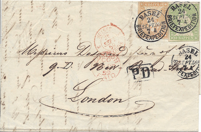 |
| Swiss letter rate to England - 60 rappen per 7.5 grams : Aug 15, 1859 - Sep 30, 1865 |
This 1859 letter was mailed from Basel and crossed into France at St Louis (across the river from Basel). It then traveled via Paris, Calais and Dover before arriving at its London destination. The total postage was 60 rappen, paid for with two postage stamps (one 40 rappen and one 20 rappen).

This is another item that I think has plenty of curb appeal. There are some nice clear markings with different ink colors. The stamps are clean and they provide some additional color at the top right.
But, look closer. There is a hole in the paper under the stamps that takes a small chunk out of the lowest Basel marking. There is some erosion where the paper has reacted to the composition of the ink. The big flourish under "London" is the easiest place to spot it. So, this item is NOT perfect.
But, perfection is not necessarily a way to achieve curb appeal when it comes to postal history, in my opinion. Some reasonable wear and tear that does not overwhelm the rest of the item actually enhances that appeal by reminding us that this folded letter was mailed over 162 years ago.
I think the word "overwhelm" is actually a key here. What do you see first when you look at an item? In this case, I see the clear readable markings that can help me tell the story of the cover. I see the positive characteristics first and I actually have to call attention to the negatives. Typically, I prefer that the positives overwhelm the negatives rather than the other way around.
Now, what if I could find another item from this correspondence that was nearly identical, but it did not have this ink erosion? Then I suppose I would prefer that one because it would have even greater curb appeal. But, just because there are a few imperfections, that doesn't mean we can't appreciate the house we've got!
"Filing folds" are natural consequences of the use of the item

Since we are currently in London, let's take a quick look-see at this letter that was sent from London in 1872 to Stockholm, Sweden. Once again, what do you see when you look at this particular cover? You see a bit of color. You see clear, readable markings and docketing so you can figure out the story that comes with the cover. And you don't see much along the lines of tears or staining, despite the age of the item.
Yes, there is some smudging of the ink for the addressee's name. The postmarks on the stamps do a pretty good job of covering up their design. And, there is a filing fold across the center of the whole thing.
We need to remember that most letters that survive from the 1850s to 1870s were probably business letters that were kept as business records. There really wasn't any interest in trying to keep these pieces as pristine artifacts of postal history and it wasn't always convenient to leave these letters folded up the same way they were delivered. After all, if they wanted to reference their records, the postage stamp along with their own address was NOT the important part. As a result, the letters were often refolded to emphasize the content - not the stamps, not the postal markings, and certainly not the address panel.

This letter was sent from a business representative named G. Contant in Lille, France. At the time, the area around Lille was well known for its textile industries. This letter was sent to the Samuel H. White Company in the United Kingdom that supplied equipment and accessories for spinning mills. So, the connection is in character with the Lille region.
Apparently Monsieur Constant was not entirely in agreement with the pricing provided by the Samuel H. White Company. And, as far as I can tell, this particular letter does not include an order or reference a particular payment. Perhaps that meant it was less likely this letter was going to be referenced all that often by those who did the filing for Samuel White? We'll never know for certain if this was how they went about filing or if they simply refolded things they were more likely to view again in the future. But, it can be fun to speculate about such things once in a while.
 |
| France to the UK - postage rate of 40 ctms per 7½ gms : Jan 1, 1855 - Dec 31, 1869 |
This cover has some pretty good curb appeal too. There is something about an item with multiple postage stamps that can actually make you more forgiving of things like some smudging on the P.D. marking or the weaker strike for Lille. Curb appeal is not always about the tiny details, even though those details can certainly impact how you feel about an item.
Curb appeal can make something that is common more appealing
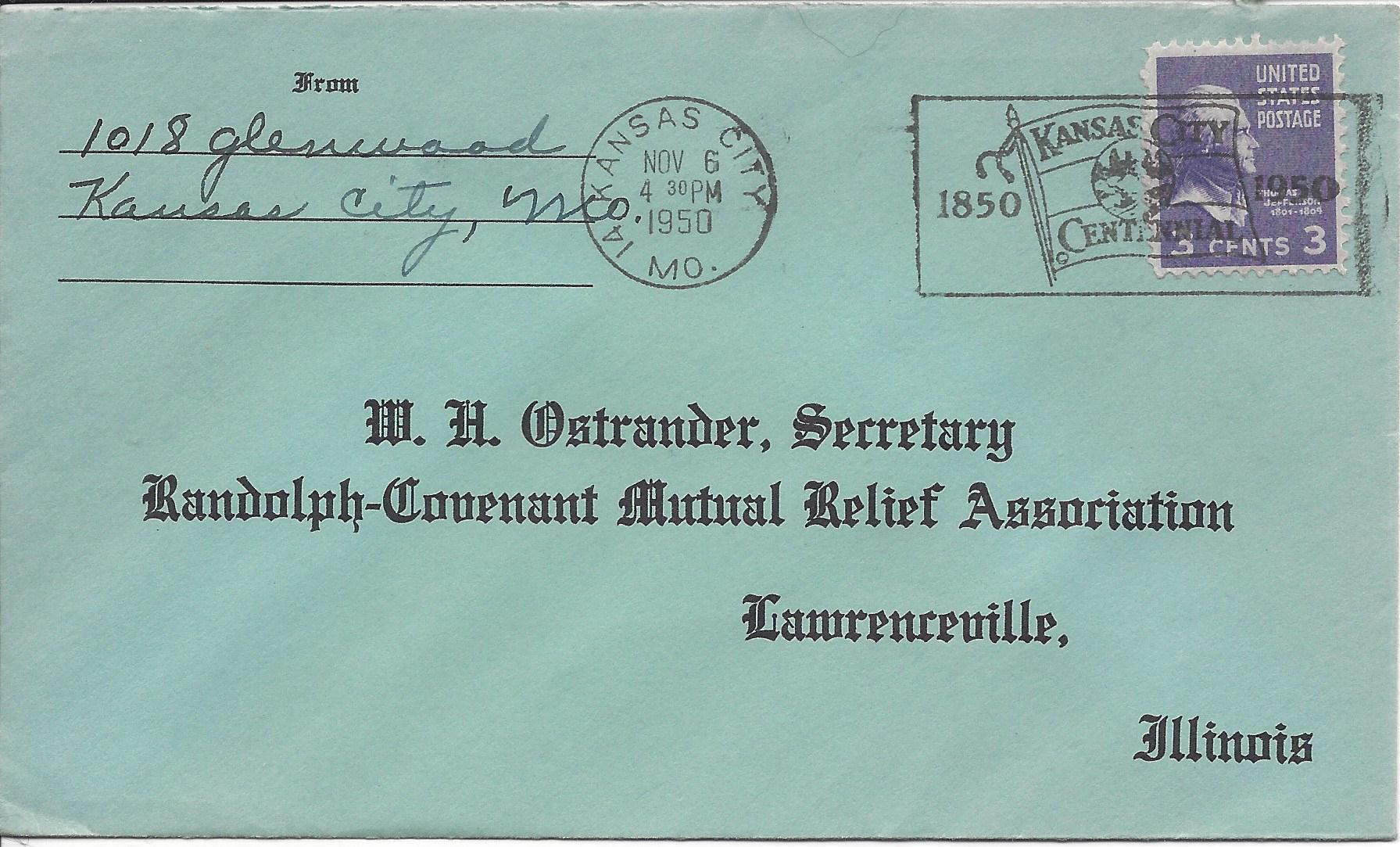
Here is a much more modern item. This envelope was mailed in Kansas City, Missouri on November 6, 1950. The internal letter rate for the United States was 3 cents per ounce - and that rate lasted for a very long time. As a result, there are many, MANY examples of simple letters with three cent stamps. In fact, this particular purple stamp featuring Thomas Jefferson is ...
Well, let's just say they're all over the place and it is extremely easy to get lots of them for little to no cost.
So, if they are extremely easy to find and there isn't anything else going on that's all that special, why would you want something that was also missing curb appeal? This one is actually quite good looking. Everything is neat and clear. There is a fancy slogan cancel celebrating Kansas City's Centennial. The postage stamp is in excellent condition. Even the pre-printed address is attractive.

If we consider my area of primary interest (postal history that features the 24 cent U.S. postage stamp from the 1861 design), there certainly can be items that have a wide range of curb appeal. There were two earlier in the blog that we compared to each other, and now I show you two more examples - the first one mailed in Boston in August of 1862.
While I am not trying to say that a letter from the U.S. to the United Kingdom using a 24 cent stamp is incredibly common, I can tell you that this is the most common use, by far, for this stamp. So, if you can find an example like the one above versus one like this....

Maybe you can get a better idea of why curb appeal might matter. After all, which one would you like to look at more often?
Hey, there might be reasons that this last item is of interest. A letter with a Chicago origin and the red "3 cents" marking is much less common than Boston. And, of course, a letter that looks like this is going to cost much less if you just want an example for your own collection and you don't (or maybe you can't afford to) care about curb appeal. Or maybe, you are attracted to covers like this because they show the wear of a life of use and abuse? Maybe we'll have to do a Postal History Sunday on "ugly covers" someday.
In the end, it actually comes down to this. Beauty is in the eye of the beholder. If you like postal history and you find beauty in them, then you will be looking for the curb appeal that makes you happiest. If you are attracted to houses with bright blue doors and sunflowers by the windows, so be it. It just so happens that I, and many other postal historians, prefer items with some of the curb appeal that I have been illustrating today.
So, why in the world am I attracted to this one? I guess that will have to be for some future Postal History Sunday.

Bonus Material
Who was Jacques Isler and what did his company do exactly? Well, here is a quick video that just might give you a clue!
In 1787, Jacques Isler founded the straw hat company that was going strong in 1832 (when the first letter in this blog was sent). According to this article in the "Hat Magazine" put out by the Straw Museum that is the transformed Isler family home, as many as 12,000 women were employed to weave these hats during the winter months.
But, as machinery was developed to mechanize the creation of straw hats, companies like Isler's worked to create designs that could not be easily replicated by a machine. They could remain relevant by focusing on the trimmings and embellishments that made hats more unique. Sure, that factory in England could pump out a bunch of hats, but Jacques Isler & Co could provide decoration that would make those hats special.
 |
| image from the Straw Museum 7/29/22 |
Well, I don't know about you, but I learned something new today! I'd never really considered how straw hats were made, nor had I really made the connection to oat, wheat and rye straw (among other crops) and straw hats. Sure - it makes sense because the connection is in the name. But, as a person who farms, I don't see straw as a decorative item - especially after I've scooped out one of the poultry rooms where we use straw as bedding.
Thank you for visiting and viewing Postal History Sunday. I hope you have a good remainder of the day and a fine week to come.
No comments:
Post a Comment
Thank you for your input! We appreciate hearing what you have to say.
Note: Only a member of this blog may post a comment.