Welcome to Postal History Sunday, a weekly online offering where I write about postal history related topics that I enjoy. Everyone is welcome here. Each article is written with the intent of making it accessible to those who do not have significant knowledge of the topic while still making it interesting to those who may have expertise in that same area.
This week I am finally going to get around to answering a question I've received on and off for the past few years. In essence, the question has to do with how I go about displaying the actual postal history artifacts.

When I don't have a display page made, I typically store folded letters and envelopes in Mylar / archival safe sleeves that come in standard sizes. There are also three hole punched, 8 1/2 by 11 inch, pages with pockets for storage of old letters and wrappers. This is where they stay until I find the time and motivation to research the covers and make a page. I can place paper slips with descriptive notes written in pencil into the sleeves or I can put a label on the sleeve or pages to help me remember key points that I've discovered over time.
Now, before I go much further, let me make something clear. I am writing from the "perfect world" perspective. Things don't always go this way all the time. I have notepads of paper with various research notes and I have electronic files with other notes - not necessarily organized in a way that makes them easy to find. This is what happens when you grab five or ten minutes here and there to seek an answer to a question. You just put the answer somewhere and hope you can find it again when you want it.
The same thing goes for when I go through the process of creating display pages. The process isn't always as smooth as it sounds because it is often interrupted by the rest of life - job, farm, friends and even Postal History Sundays!

Shown above is the display page for the item that I used to open up this week's article. This piece of printed matter included all of the contents, so I also had to make choices about what I wanted to display and what I was okay with not showing on the page. Happily, the technology to scan items and make images that I can re-size makes it easier to illustrate as much (or as little) of the interior, or reverse, of an item as I choose.
This particular item has more content than is illustrated on the display page. Clearly, choices had to be made in the interest of clarity and aesthetics. And that's one of the main issues when it comes to creating the page - how do you use the "real estate" available for each item in the best way? If you want to keep things to a standard page size, there are some very real boundaries that need to be considered.
I like to include some consistent information on each page, such as the postage rates, information about the route the item traveled and a description of the postage stamps (if any) used to pay the postage. I also like to provide some additional point(s) of interest - usually at the bottom of the page - because I've just got to be me.

I create my page designs in a software program called Visio, which allows me to lay elements out on a grid, opening up the possibility that I can place an element anywhere on the page. I use a scan of the postal history artifact that is scaled to its original size so I can make sure everything will fit on the page. You might notice that I opted to experiment a little with the layout for the item shown above.
It
is not uncommon for me to take digitized copies of maps from the same
period of the postal history item(s) I am displaying. I use open source
software called Gimp to fade out the map and add my own highlights as I
deem necessary. For the map above, I darkened the country borders and
provided bolder labels for geographic features that applied to the
postal history shown on the page.

My
interest in postal history stems from philately (the study and
collecting of postage stamps), so it should not be a surprise that I
have mixed the two on a page. One of my favorite postal issues from the
Netherlands is shown above with a single cover to illustrate the use of
the most common denomination (5 Dutch cents). This has become a bit
less common for me to do as I move further into postal history and seek
to find new homes for much of the off-cover stamps
Once the page is ready to print, I use acid free paper and mount the item(s) with archival quality corner mounts (the stamps have special mounts, but I'm not getting into that). The entire page is housed in a mylar sleeve (also archival quality). I take as much care as I am able to protect these pieces of history so they will not degrade and future caretakers can enjoy them and explore them just as I have. It's part of the responsibility that comes with the pleasure I get in viewing and researching the items that come my way.
And remember, most of the things I enjoy are from the 1860s - well over 150 years old.

Shown above is a page that highlights the item featured in this Postal History Sunday. Clearly, my display techniques have changed a bit over time. But, it does beg the question "which comes first, the display page or the Postal History Sunday article?" In this case, the page came first. In the past couple of years, more and more items have gotten the honor of having the article prior to the display page. In fact, I have many items awaiting the display page treatment despite their appearance in Postal History Sunday. Either way, I like to do a certain amount of research on an item before I finalize an article or a page.
The challenge with making a display page after writing a Postal History Sunday is attempting to eliminate 95% (or more) of the detail so it will fit in limited space. If I want to go from display page to article, nearly everything can be migrated.
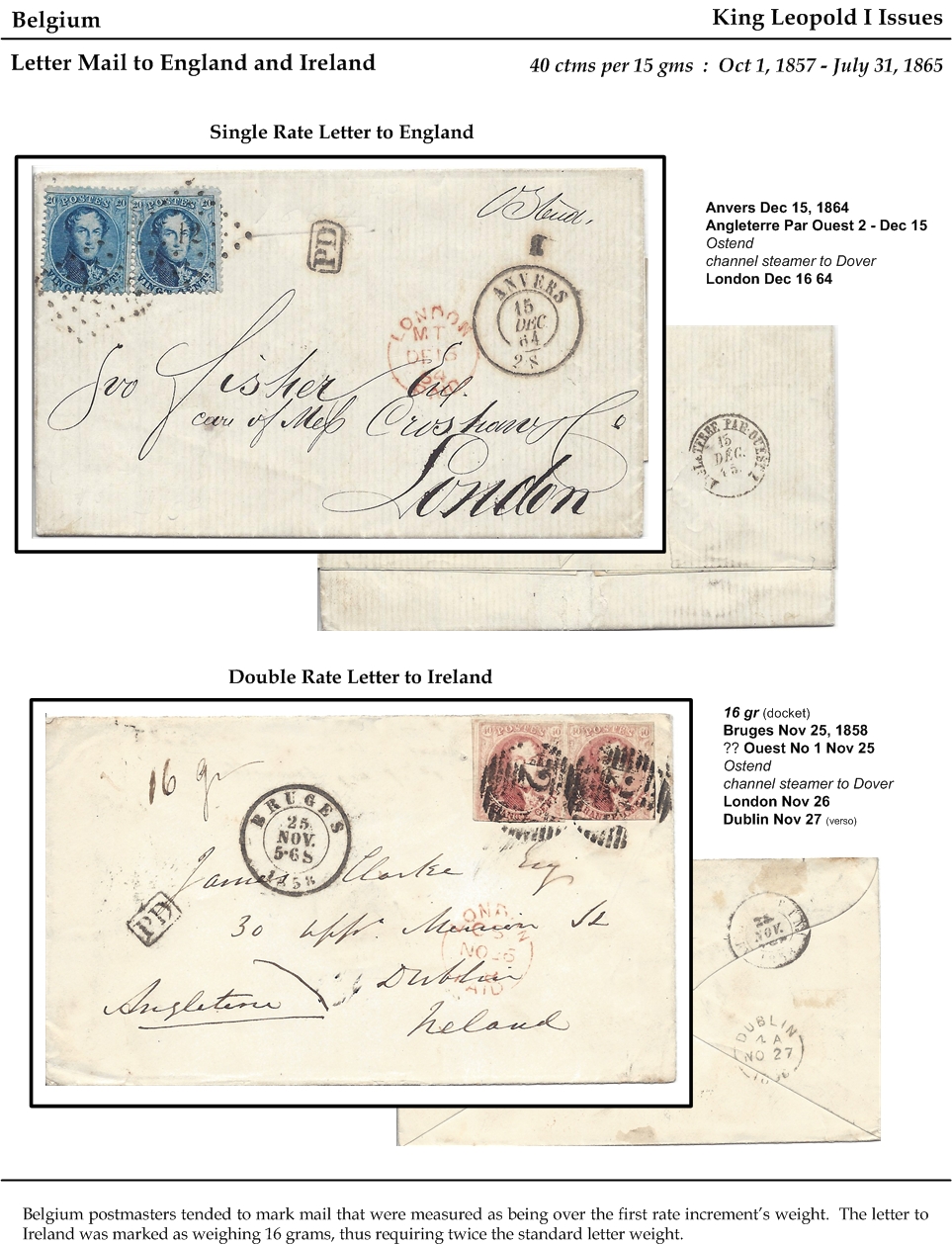
Often, a display page has a purpose that goes beyond telling the story of a single cover. The example shown above was simply intended to give examples of mail between Belgium and the United Kingdom in the period between 1857 and 1865. The information that applies to all items on the page is shown in the header. Each cover has its own heading and a block of details that explain the travels it took.
Sometimes, I decide it is important to see postal markings on the verso (back). In that case, I will take a scan of the back and print a reduced size version on the page. If I don't have much space, I might simply show the portion of the back with a marking. Either way, I resize the image until I like how things look (and I can clearly see the marking). And, no, I don't reduce every item to the same percentage of their original size. Sometimes, I actually increase the size of a feature so i can see it better. It's all a question of looks good to me.

Here is a page that was created before a Postal History Sunday appeared to feature the covers shown. Sometimes, the critical information to help understand what is going on can best be illustrated with a simple table.
Part of the point of a display page is to impart information in the most clear and efficient way a person can manage. Often, words are the least efficient medium, especially when space is limited. So, I like to use maps, tables, headings and consistent lists of the markings and places a letter visited during its travels. While I do like to have some freedom to make a page look good to me, I also like to have some consistency so I can quickly find and understand the details I uncovered as I researched each item.
But things change some once I decide that my display pages are meant for an audience that is bigger than me.

Shown above is the second page of my exhibit titled "The Postal History of the 24 cent 1861 Adhesive." This exhibit now contains 128 pages and people typically view the exhibit while standing because the exhibits are placed in A-frame displays in the exhibition area. That means it is important to provide some consistency from page to page so a person can quickly figure out what is interesting about each and every item. It is also important to arrange the pages in a way that makes sense and has a purpose.
To help viewers, I included the page above to explain how to find and interpret things on any individual page in the exhibit. It's all about communication. You want to give the viewer as many tools as you possibly can to help them succeed as they attempt to understand what you are trying to share.

The article titled Timing is Everything gives you the Postal History Sunday version of the exhibit page shown above. It's a rare moment where both a table and a map show up in an effort to explain the travels of the folded letter being displayed on the page.
The challenge is to make it possible for a person to walk up and decide to view any page anywhere in the exhibit and get something out of that page that interests them. This is combined with the challenge that the entire exhibit has to hold together and make sense for the person who is looking for a logical progression from page to page. Creating something that can be successfully viewed in order or piecemeal is difficult, but well worth the effort.

I will leave you with this last example of a display page. Sometimes, if a topic area is new to me, I find myself working even harder to find ways to explain what is going with enough detail and breadth so I can come back to it later and re-learn what I have discovered before.
In
this case, I included a map, so I could get a quick geographic picture
of where this letter traveled. A photo of the coastal steamer that
likely carried this item adds some color. The description at the bottom
summarizes some of my learning for future use if I want it.
There are markings from the verso (back) of the folded letter, including a brief explanation for one of them. Two of the markings are not actual scans from the cover, instead they are enhanced tracings from other sources because the actual markings on the cover are smudged and incomplete. Simply illustrating a poor example of a marking does nothing to help me learn to see what I am looking at. But, if I compare the complete examples at the left with the actual markings on the cover (they are both there), I can train my eyes to see them in the future.
And there it is! A brief look at how I go about making display pages for postal history items. If you were looking for more postal history content this week, it's actually already here. Click on the display page images and look at a larger version of each one. You can then view maps, short descriptions and gather interesting information about each and every item!
Thank you for joining me this week. I hope you have a great remainder of your day and a fine week to come.
-----------------------------------------------
Postal History Sunday is published each week at both the Genuine Faux Farm blog and the GFF Postal History blog. If you are interested in prior entries, you can view them, starting with the most recent, at this location.
No comments:
Post a Comment
Thank you for your input! We appreciate hearing what you have to say.
Note: Only a member of this blog may post a comment.